If you still hate opening the lower-left corner of your desktop, relief has finally arrived. Microsoft just released a complete overhaul for the Windows 11 Start menu as part of the November 2025 Patch Tuesday cycle. This update ditches the fragmented, click-heavy layout that frustrated users since 2021. Instead, it delivers a unified dashboard that categorizes your software automatically and remembers exactly how you like to work.
Scrolling Replaces Clicking for Good
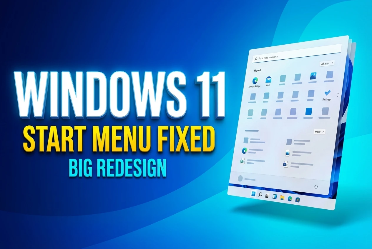
The old “All apps” button is dead and buried. You no longer have to click through multiple screens just to find a program you installed last month. The updated design uses a single scrollable page that holds everything you need in one continuous view. Pinned items sit at the top, recommendations live below them, and your entire software library follows right after.
By default, this new layout uses a Category view. This system automatically groups installed software into folders like Productivity, Entertainment, and Social, placing your most frequently used programs at the top of each stack. This works entirely offline using a 15MB local JSON mapping file, meaning the menu does not need to ping external servers to figure out where your new photo editor belongs. If a specific category contains fewer than three apps, the system simply drops those programs into a generic “Other” bucket to prevent folder clutter.
If you hate having your software organized for you, the classic grid view remains available. You can toggle back to an alphabetical A-to-Z grid directly within the menu, and Windows will permanently remember your preference. Early testers report that this simple switch saves multiple clicks every single day, especially for power users who rely on muscle memory to launch their tools.
A Design That Scales to Your Screen
On a large high-resolution monitor, the old interface looked like a tiny floating island surrounded by empty desktop space. The new layout fixes this by reading your hardware configuration and adapting its dimensions on the fly. When viewed on an ultrawide display, the interface automatically adjusts its size based on your screen resolution to show up to eight columns of pinned icons.
Smaller displays receive a much tighter arrangement. A standard laptop screen drops down to six pinned columns and only three app category columns. According to technical tests covering details on the adaptive interface scaling, the new menu can occupy up to 90 percent of the vertical screen space on standard 1080p monitors. This aggressive scaling responds directly to a 2025 Microsoft survey of 10,000 participants, where 65 percent of users demanded better space utilization.
| Feature Element | Old 2021 Layout | New November 2025 Overhaul |
|---|---|---|
| App Navigation | Requires clicking an “All apps” button | One continuous scrollable dashboard |
| Layout Options | Strictly alphabetical list | Smart categories or expanded grid |
| Display Scaling | Fixed dimensions regardless of screen | Adapts dynamically to monitor resolution |
| Recommended Tab | Always visible taking up space | Can be fully hidden for a cleaner look |
If the expanded layout feels overwhelming on a smaller monitor, you are not stuck with it. You can visit the System Display settings and lower the overall interface scale, which shrinks the menu footprint without removing any of the new navigational tools.
Hiding the Clutter and Removing Edge
The single most requested feature since Windows 11 launched was the ability to reclaim space from unwanted suggestions. By navigating to the personalization settings, you can now hide the Recommended section entirely with just a few toggle switches. Turning off suggested files, recently added apps, and web history causes the bottom half of the menu to vanish entirely.
For users in the European Economic Area, the customization goes much further due to new regulatory rules. To satisfy the Digital Markets Act, Microsoft updated the operating system so European users can disable Bing search and uninstall Microsoft Edge directly from the standard interface. This ensures the company does not unfairly prioritize its own web services over local search results or competing browsers.
If you are exploring the recent European Digital Markets Act compliance changes or just want a cleaner workspace, here are the best ways to tidy up your system:
- Flip off all recommendation toggles in the Personalization menu to collapse the suggestions area.
- Pin your most critical daily tools to the very top row so they appear instantly on open.
- Ensure the search bar settings are configured to prioritize local files over web results.
- Check Windows Update for builds like 26200.7019 or 26100.7019 to ensure you have the patch.
The Push Toward an AI-Driven Desktop
This structural redesign sets the foundation for deeper system integration. Hidden inside recent testing builds, a new sidebar feature called Start Menu Companions has officially made its debut. These companions allow programs like Phone Link to display live data directly adjacent to the Start menu, giving you quick glances at recent text messages or contacts without opening the full application.
This companion feature addresses the void left behind when Microsoft killed Live Tiles in the transition from Windows 10. By moving widget-like functionality to the side panels, the core menu stays focused on launching software while still offering quick information hits. It fits neatly into the company’s broader strategy for getting started with the November update and moving beyond static interfaces.
“Windows is evolving into an agentic OS, where AI works on your behalf across the platform.”
While speaking about the operating system’s evolution, Corporate Vice President Pavan Davuluri made it clear that user feedback drove this specific round of changes. The company acknowledged that the initial 2021 release missed the mark for many workers, and this new adaptable format is their direct apology.
Here is a helpful video breaking down the layout changes in action:
When you sit down at your desk tomorrow morning, the way you open your files and launch your software is going to feel noticeably faster. The #Windows11 redesign finally acknowledges what desktop workers have been asking for since the operating system first launched. By prioritizing actual usability over rigid minimalism, this #StartMenuUpdate represents a much-needed return to form for Microsoft’s flagship product.


